Designing Filters in a Scientific Way
In this article, I will initiate a discussion about filter design on mobile devices. It is based on my experience designing the core customer journey for Chinese users at Booking.com.
PROBLEM SCOPING
Hick's law presents a challenge between the time it takes to make a decision and the number and complexity of choices. Filters, when applied, not only mitigate overload by reducing thousands of products into a manageable amount but also surface choices tailored to users' interests and needs in a straightforward way.
Therefore, a sound filtering experience is key to simplifying or moving the decision-making process. It allows users to find what they are looking for effectively and efficiently.
Given the importance, I started researching our current solution to understand the main customer pain points and size our business opportunities.
RESEARCH
The research aimed to translate quantitative and qualitative evidence into strategic and tactical insights regarding
- Core value of filters, relevant users' needs and habits
- Findability and usability of the existing solution
1. Quantitative - Correlation with Business
The first step was justifying business impact by investigating the correlation between converted users and their filtering habits.
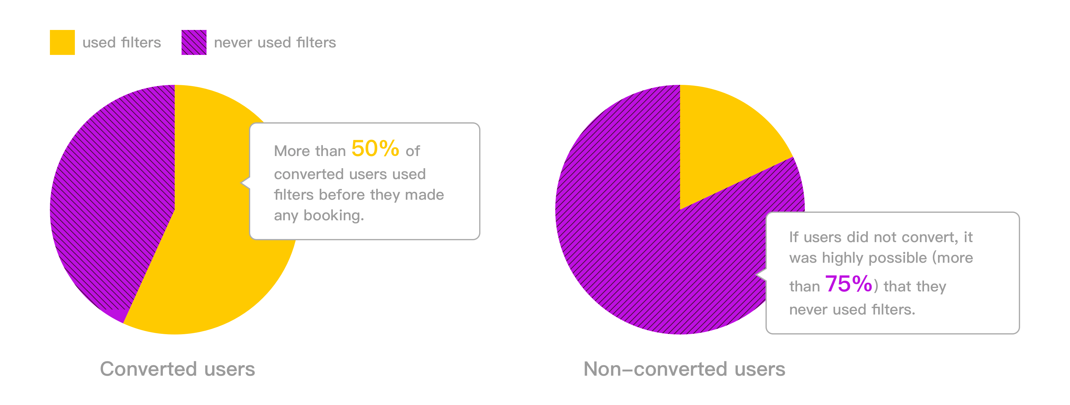
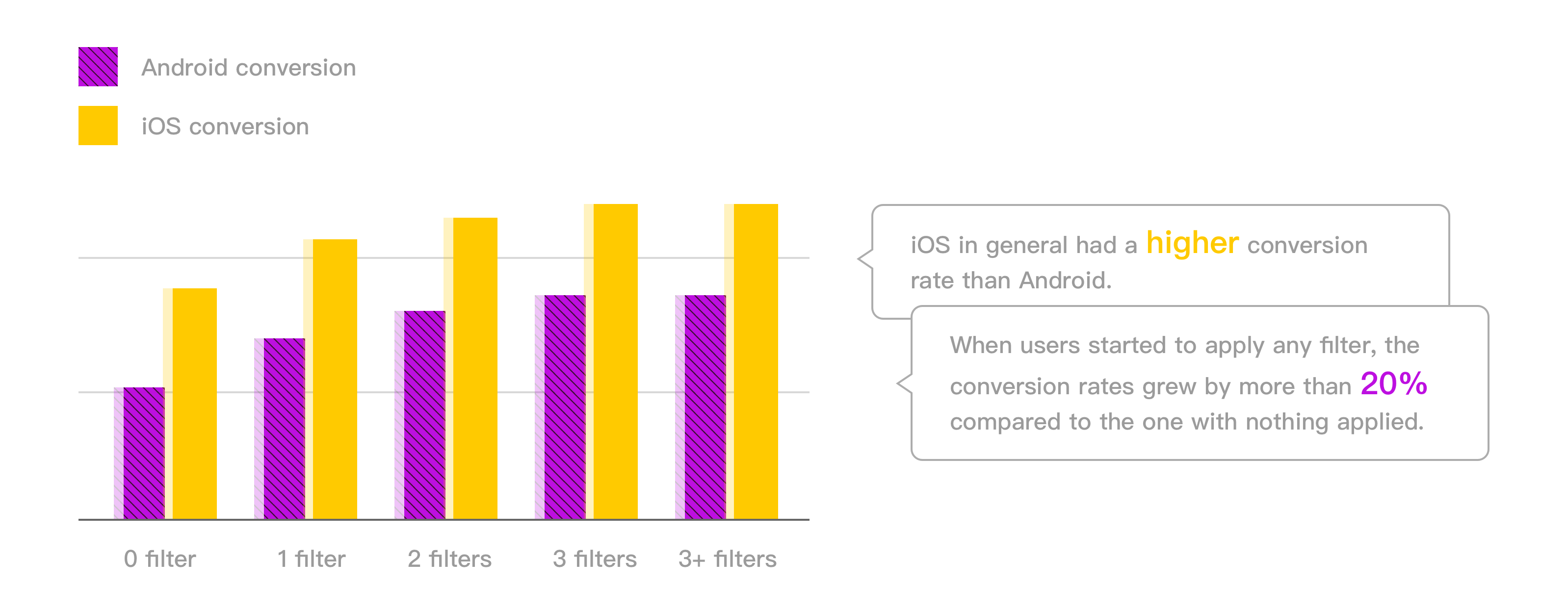
As shown in the graphs, filtering behaviors from non-converted and converted users were not the same. Users with stronger motivations were prone to interact with filters. On the other hand, for groups where people applied any filter, the conversions were at least 20% higher.
It proved the business value of filters since they kept high intent users in the converting funnel.
2. Quantitative - Usability Indicators
I moved on to creating indicators that measured filter performance.
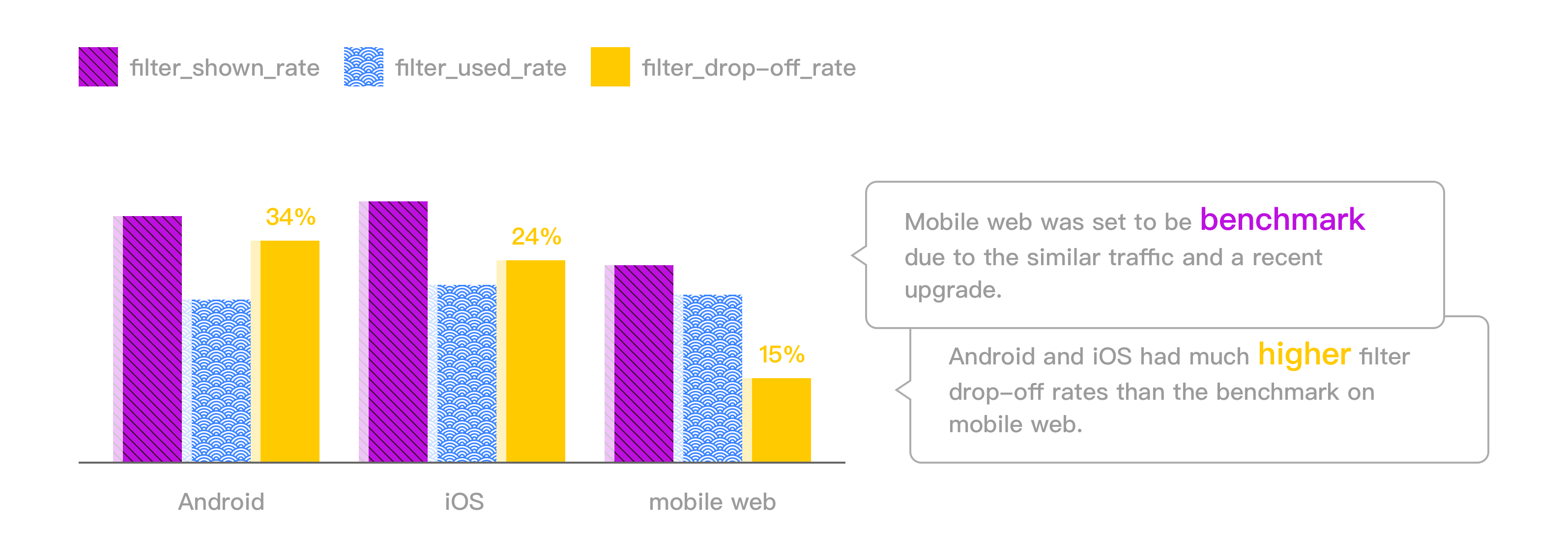
Two fundamental indicators were sr_filter_shown and sr_filter_usage. One recorded how many users opened up the filters page while the other recorded how many users ended up applying filters. Furthermore, I considered the difference between the two as a signal that captured the friction users experienced during the filtering process. The larger the difference, the worse the usability.
Another metric to look at was the distribution of different amounts of applied filters, e.g. sr_applied_1_filter and sr_applied_2_filters. Increases in average and slope may inform better ease of use.
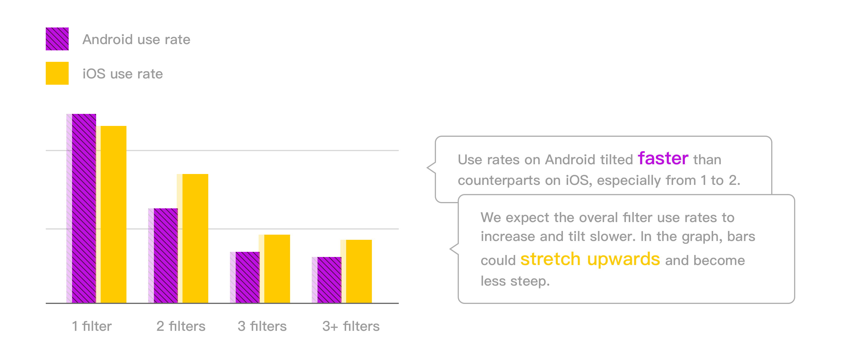
3. Quantitative - Frequency of Use
I checked the applied frequency of various filter options. Undoubtedly the data was influenced by user persona and design solution, but it still inferred a general preference for price, location, rating, and property type.
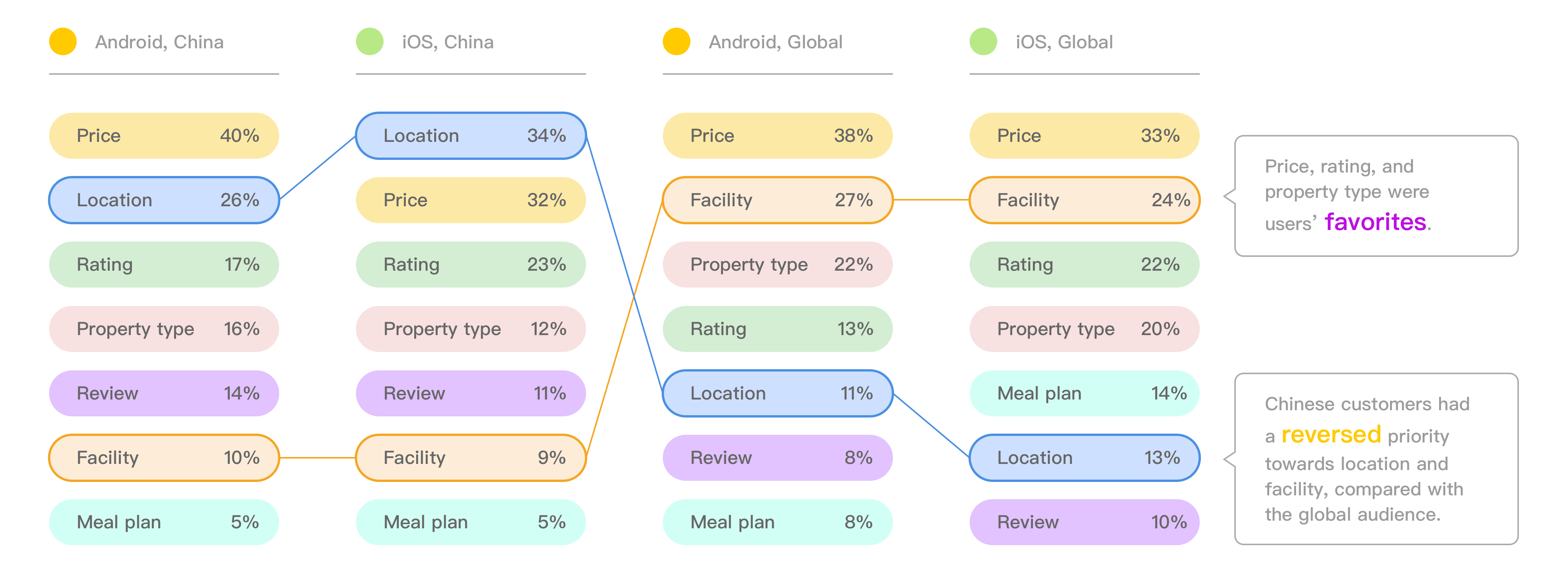
The distinction regarding priorities of location and facility reflected how Chinese user base differed from the global.
4. Qualitative - Guerrila Testing
On the qualitative side, I ran a street testing on a sample of 10, asking the participants to choose a stay for the forthcoming trip. Merely interrupting, I was able to observe the most authentic user behaviors and evaluate usability closest to real situations.
I grouped the perceptions into three aspects, namely, discovery, understanding, and use, with a particular focus on effectiveness and efficiency.

I saw findability and usability issues out of the notes, hurting the effectiveness and efficiency to filter out preferable stays.
5. Qualitative - Lab Study
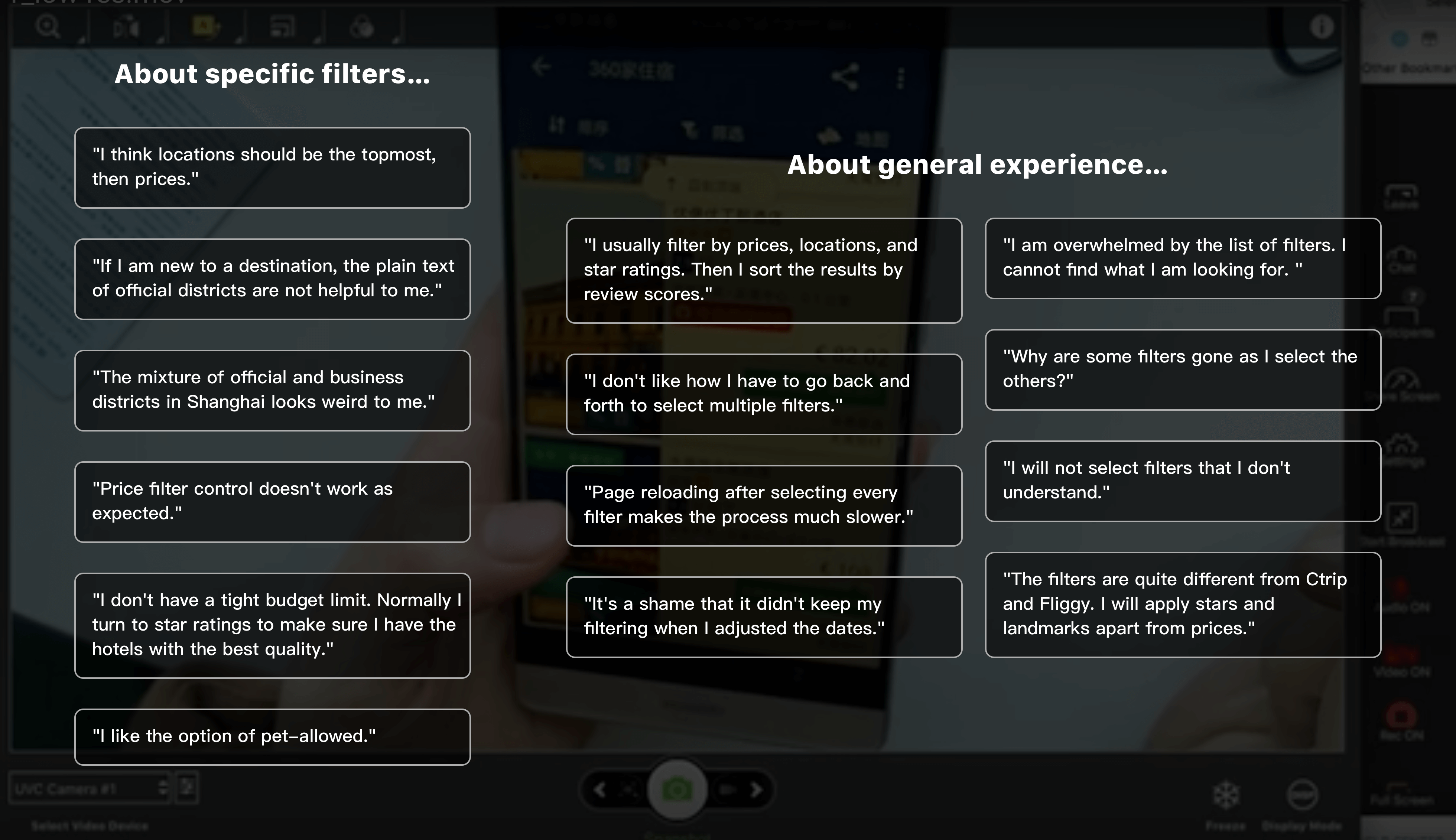
As a next step, I conducted a lab study where participants performed filter-related tasks, compared with competitors, and gave their thoughts about the overall experience. Users were encouraged to think aloud and provide the most meticulous feedback.
Here is an excerpt of their comments:
6. Qualitative - Survey
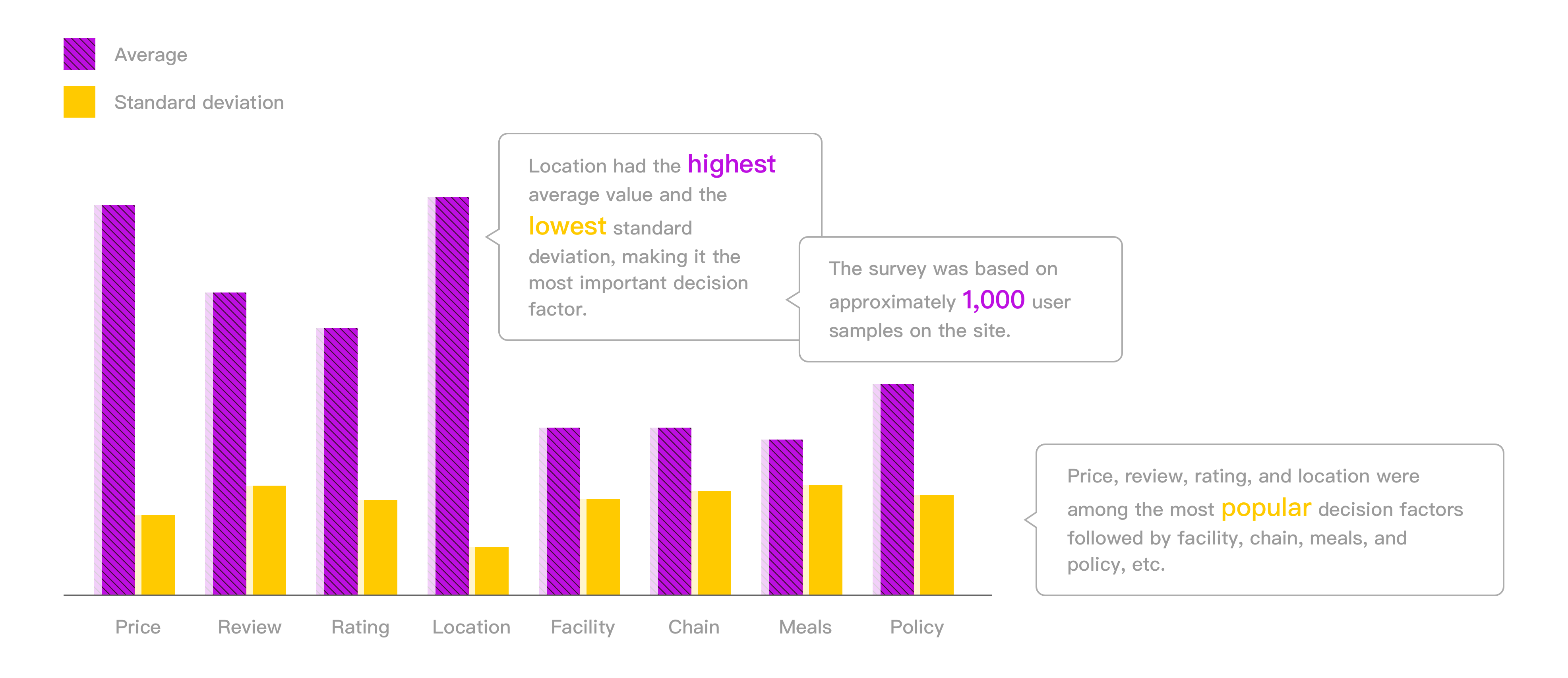
Lastly, I carried out a survey that asked people to rank the filter criteria according to their preferences. For each criterion, I calculated its average and standard deviation of the ranking scores. Therefore, by picking ones with higher means and lower standard deviations, I identified the most popular decision-making factors, that were, location, price, rating, and review.
IDEATION
Research Insights
After a comprehensive analysis of research data, I extracted the insights at different levels.
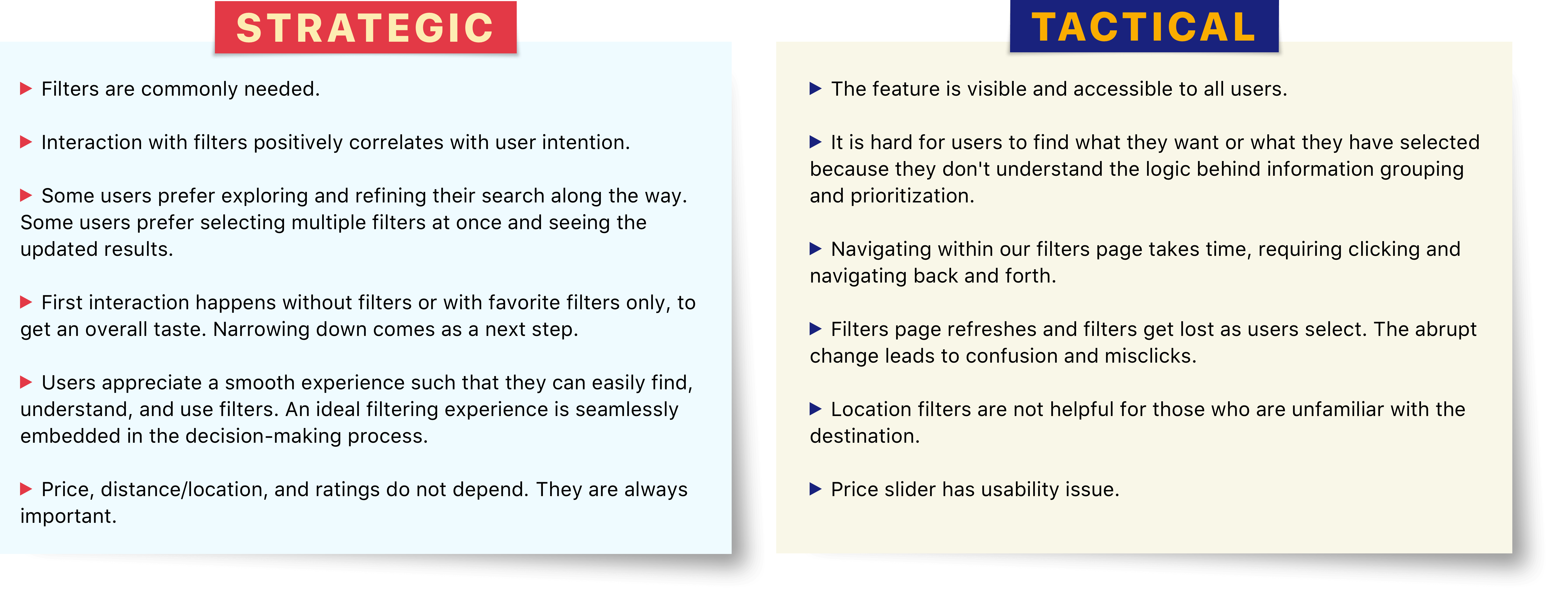
User Pain Points
Combining all the outcomes, I was able to uncover the top three pain points.
- Navigation and discovery—For users that have the intent to use filters, it is exhausting to navigate and find what they want.
- Interaction—For users that have the intent to apply more than one filter, it is painful and confusing because options get lost and positions get shifted as they select.
- Information—For users that have certain preferences, it is difficult to find the content usable or useful.
The pain points showed three improvement directions, that were, ease of filter discovery, ease of filter selection, and validity of filter information.
Design Concepts
Therefore, I mapped our pain points to correspondent design concepts.
- Minimize the effort of discovering and navigating filters options that users want
- Minimize the effort of selecting and applying multiple filter
- Reduce cognitive gaps introduced by information, compared with competitors, and customer expectations in China
The concepts were carefully defined to make sure that 1) they were well-aligned with the nature of filters; 2) they shared the same vision to enable an effective and efficient look-to-book experience for local users.
DESIGN SOLUTIONS
Booking.com uses hypothesis-based A/B testing and its statistical outcomes to measure the effectiveness of any design change. For the sake of data credibility, I decomposed the revamp into a list of optimization design stories, with each one of them tackling a focused problem and getting measured by specific metrics.
1. Quick Filters
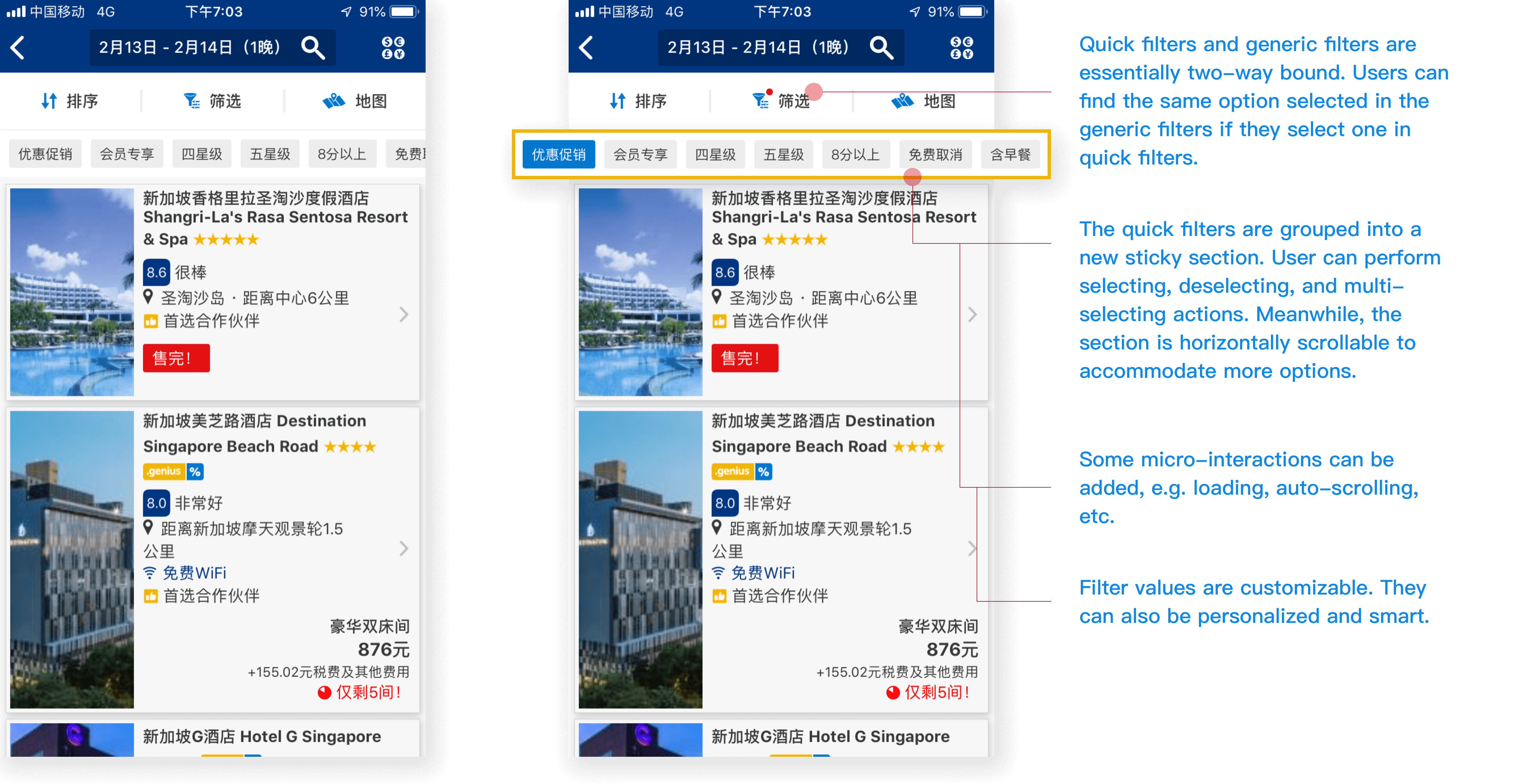
DESCRIPTION
I wanted to identify and surface the most valuable filters directly as quick filters. They were grouped into a new sticky section under sort/filter bar. Users could perform selecting, deselecting, and multi-selecting actions. Meanwhile, the section was horizontally scrollable to accommodate more options.
METRICS
① sr_filter_usage ② sr_clicked_after_filtering ③ sr_booked_after_filtering ④ net_conversion
2. Split Modules
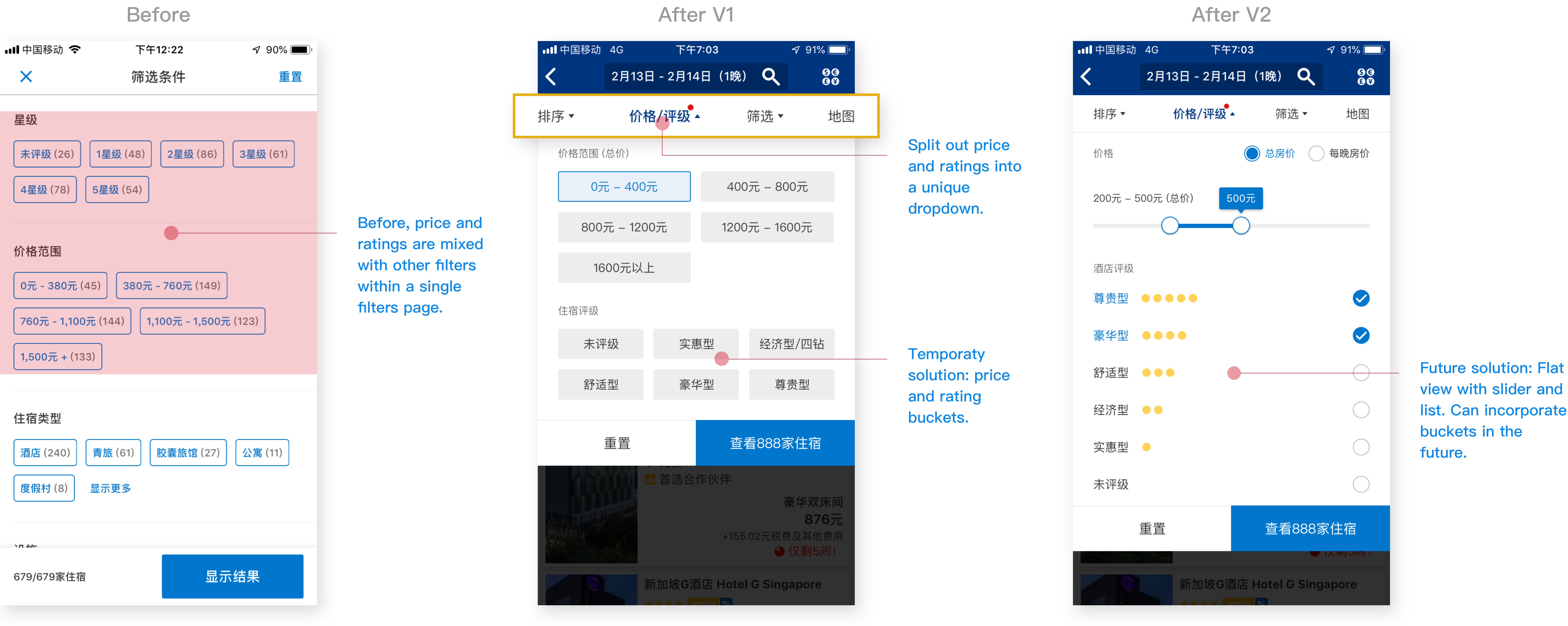
DESCRIPTION
Due to the general preference and the contribution to filter usage, I separated filter options of price and ratings from the rest and bundled them into a new module. Users could quickly access to the module via its entry point in the new sort/filter bar. Besides, it helped release space for the original module to ensure more efficiency and scalability.
METRICS
① sr_filter_shown ② sr_filter_usage ③ sr_clicked_after_filtering ④ sr_booked_after_filtering
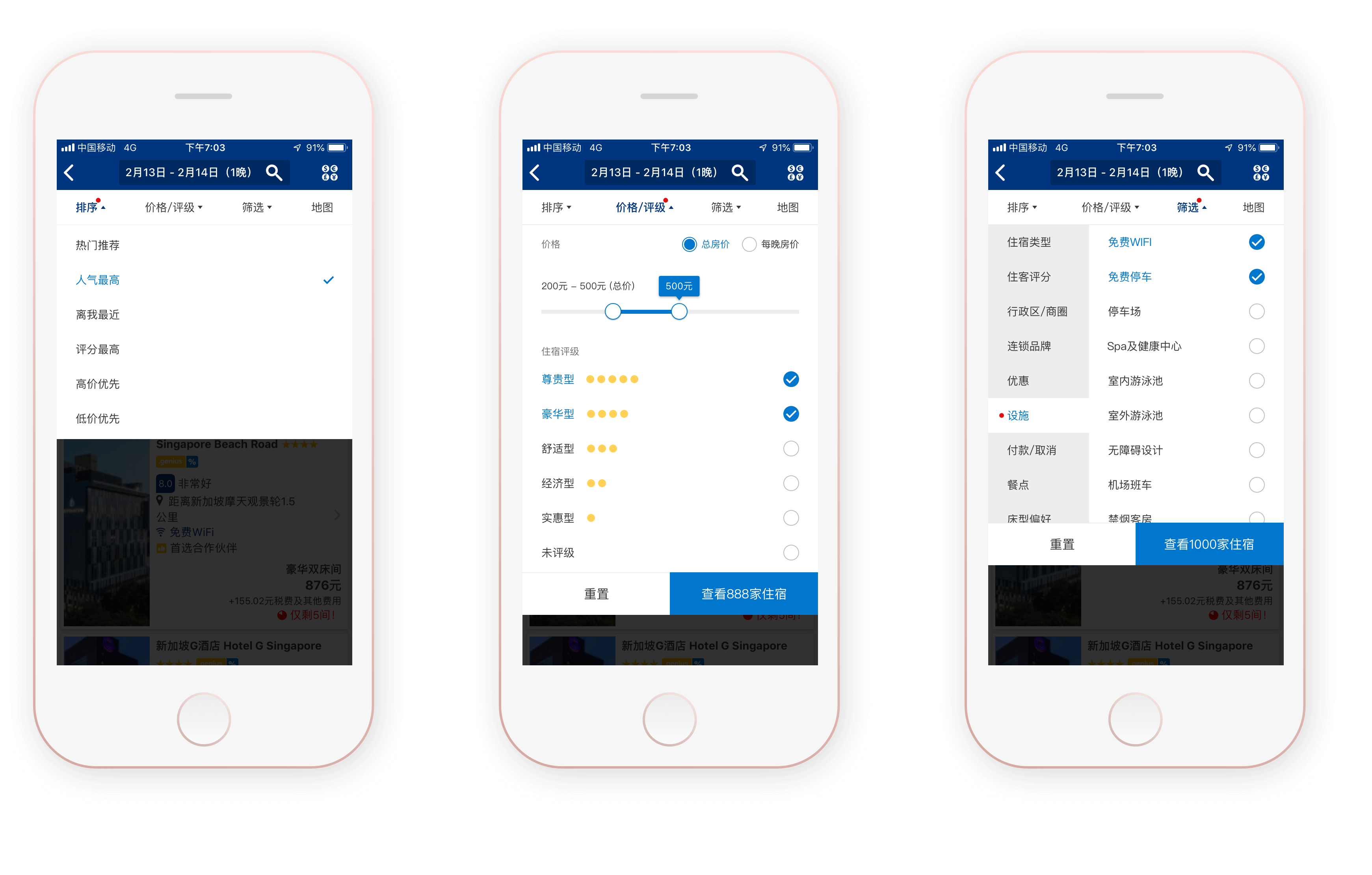
3. Flat View and Dropdown

DESCRIPTION
I wanted to simplify page hierarchy and information architecture using a simple and straightforward user interface. The exquisiteness of Chinese characters, luckily, allowed me to organize filter information into a flat view. I placed filter categories on the left and filter values on the right. With sufficient white space and little overflow, this view helped users browse, select, and apply filters effortlessly.
I also used the dropdown and overlay to keep users in the context of the search results list.
METRICS
① sr_filter_shown ② sr_filter_usage ③ sr_clicked_after_filtering ④ sr_booked_after_filtering ⑤ sr_no_results ⑥ net_conversion
4. Static Filters and Let Users Know When to Stop

DESCRIPTION
While users selected their preferable options one by one, our current filters, either their existence or counts, got automatically updated according to the inventory availability. In short, they were dynamic filters. From user research, I knew that this feature led to a lot of confusion and misclicks. Therefore, I wanted to switch to the static mechanism such that filter options would not abruptly change on the fly.
For users who preferred seeing the results change, I provided a number indicator to let them know when they were done selecting. And to ease the anxiety during the loading, I introduced an animated spinner in the transitional state.
METRICS
① sr_filter_shown ② sr_filter_usage ③ sr_clicked_after_filtering ④ sr_booked_after_filtering ⑤ sr_no_results
5. Regroup and Re-prioritize Information

DESCRIPTION
A truly usable filtering experience provided filter categories and filter values that were appropriate, predictable, free of jargon, and prioritized. However, it was never one-stop to achieve information validity. Instead, I refactored the information step by step and mainly examined four dimensions along the way: 1) Common sense, 2) Users’ preferences, 3) Data readiness in terms of completeness, accuracy and granularity, 4) Business needs.
METRICS
① sr_filter_usage ② sr_used_popular_filters ③ sr_clicked_after_filtering ④ sr_booked_after_filtering
6. Add Descriptions to Locations
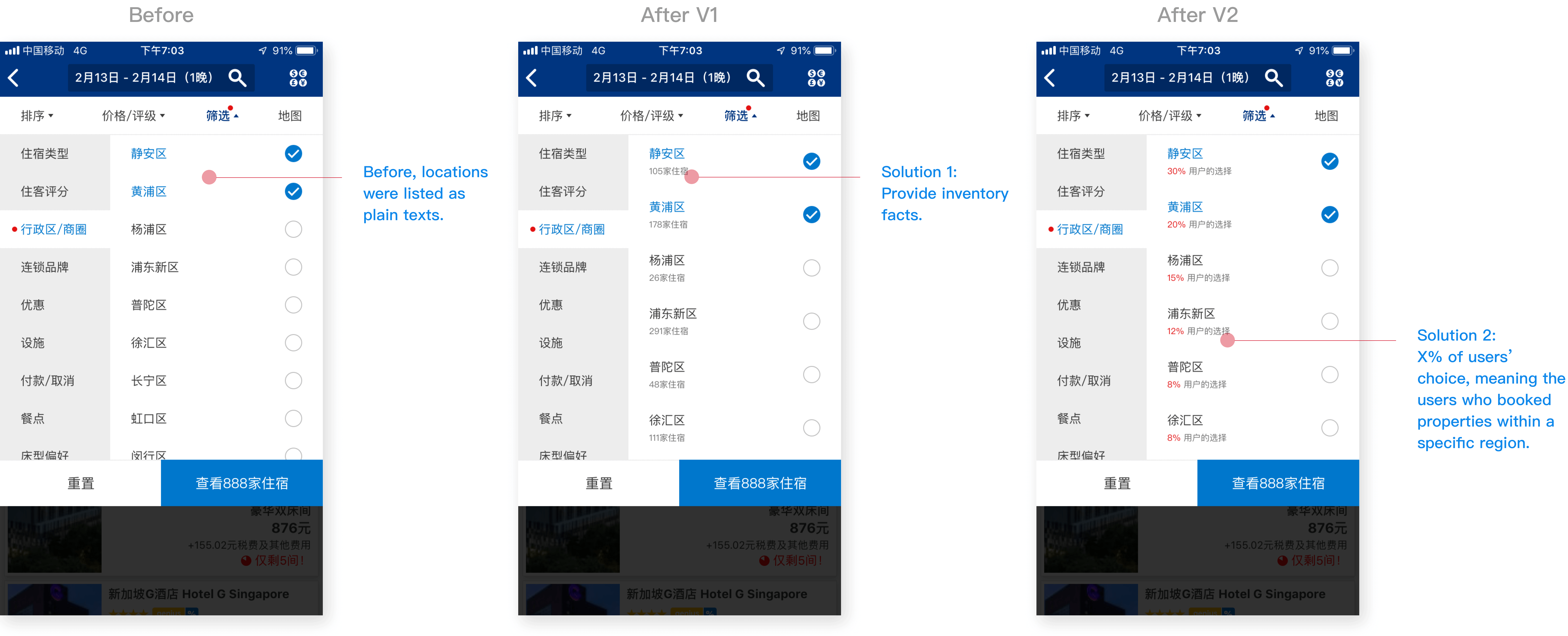
DESCRIPTION
We learned that users wanted to find a nice location. When they started searching for accommodations, they did not have enough knowledge to choose based on the district name only. Therefore, I offered them additional descriptions in the forms of two: 1. Inventory facts; 2. X% of users’ choice serving as social proof.
METRICS
① sr_filter_usage ② sr_used_location_filters ③ sr_clicked_after_filtering ④ sr_booked_after_filtering
HIGHLIGHTS
There are three topics worth highlighting of filter design.
1. Batch Filters vs. Interactive Filters
While filters look similar in many products, their behaviors vary widely. Can users adjust multiple filters before the results of the compound query are returned, or are the results returned after each filter value is specified? Answers indicate two filtering mechanisms: batch filters and interactive filters. Choosing between a batch and an interactive implementation mainly depends on user intent and site speed.
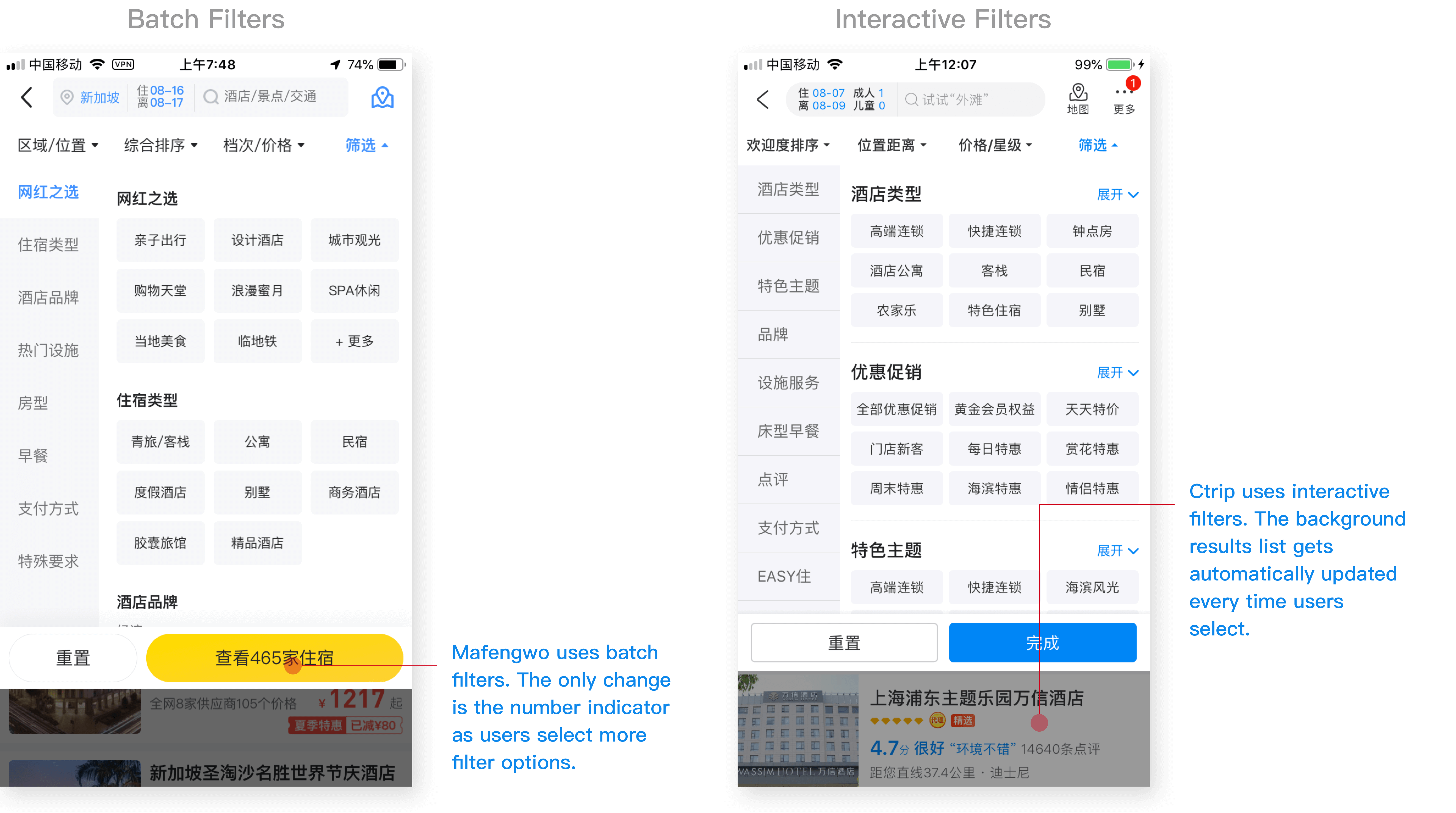
Exploratory users who do not have a clear search goal need to learn about the search space and the possible options. These users will benefit most from interactive filtering. Alternatively, determined users who already have multiple criteria in mind will benefit from batch filtering. But how to predict users’ mindsets while they are filtering? In this case, one solution is letting users tell us when they’re done selecting filters. It means to include an apply button in the filter design. Users can click on that button once they’ve indicated all the preferrable filter values.
Site speed is a much obvious factor. If we expect the queries to be instantaneous, then interactive filtering will be less offensive. If the product is likely to be slow, then batch filtering can save users some waiting time.
To summarize, knowing when to stop and apply filters allows users to smoothly progress towards their goals while maintaining a sense of UI stability and user mastery.
2. Powerful vs. Optimal
A powerful feature usually improves capability and flexibility from users. However, the most advanced filters do not necessarily guarantee optimal user experiences.
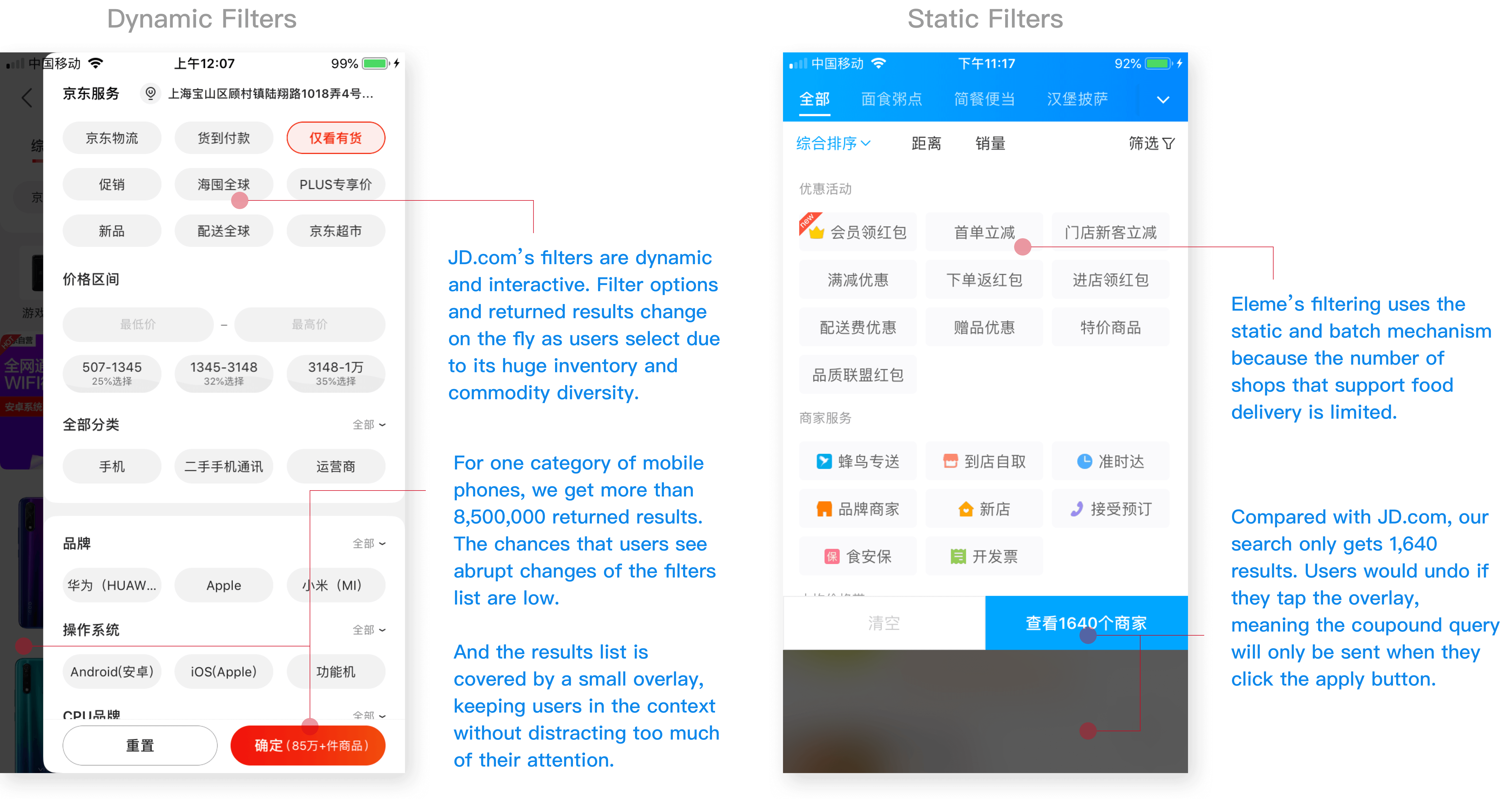
The first example is about dynamic filtering, being popular among e-commerce giants like Taobao and JD.com. The reasons why they stick to this pattern are 1) they have thousands of commodities 2) commodities are mainly tangible 3) servers are robust and reliable. Compared with them, 1) accommodations form a relatively small inventory 2) accommodations are intangible, heavily influenced by seasons 3) servers are remote and slow. In this case, if I appled the same solution, users were more likely to see drastic filter shifts and page re-structures, which severely disrupted their filtering process.
Another example is about separating the location filters. Due to the immaturity of current geographical information and the misplacement of map feature, I proposed to defer this separation.
To summarize, when designing for filters, we should consider
- Nature of commodity
- Inventory and availability
- Maturity of data
3. Overfiltering
I found that the more I encouraged people to use filters effectively and efficiently, the more they would encounter the empty state of search results.
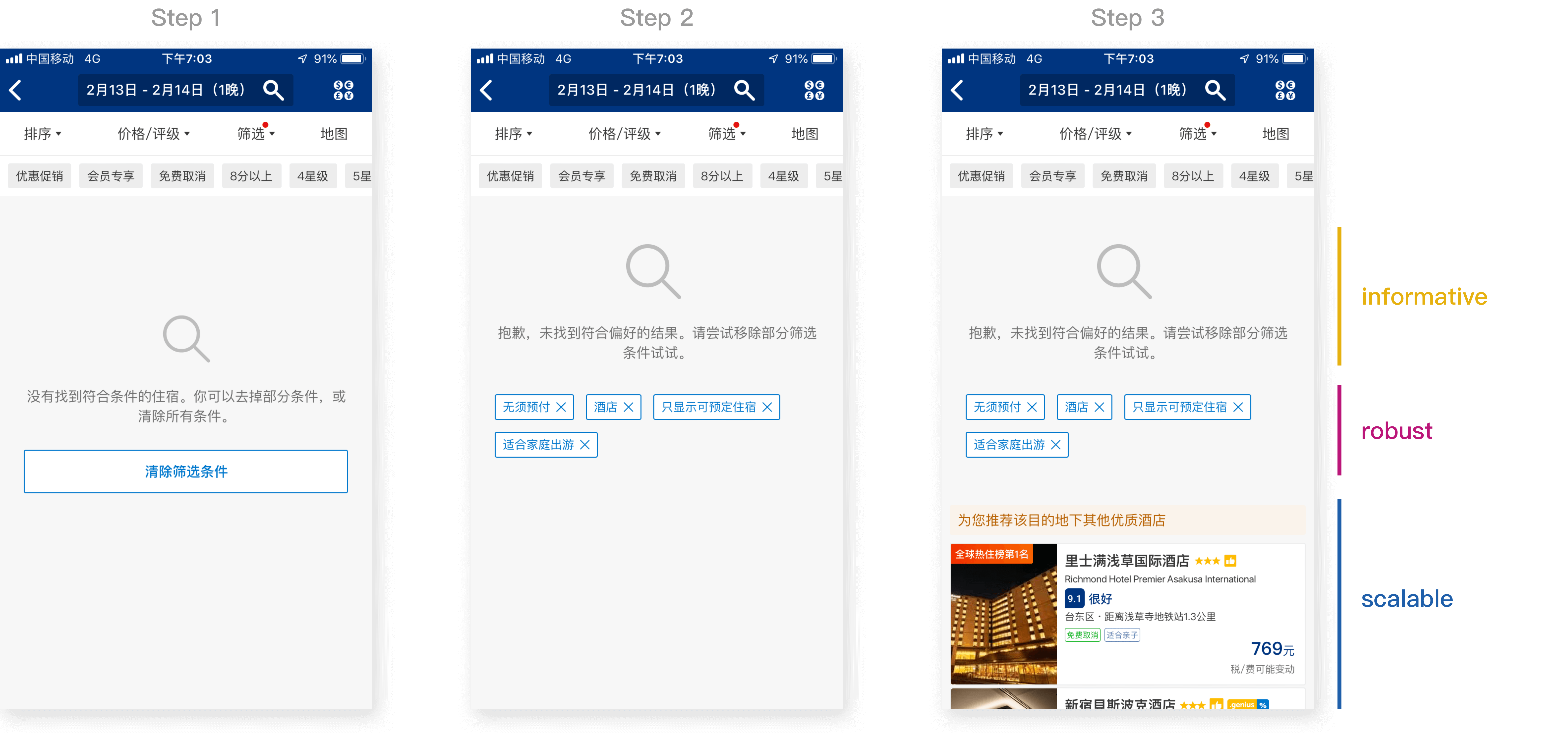
I believe that instead of preventing overfiltering, a better solution is to build an informative, robust, and scalable empty state as it ensures better flexibility and guidance to users. When users get zero matching properties,
- Informative—Remind them that this is an overfiltering result, and lead them to change filter choices
- Robust—List the filters they applied, make it flexible and easier to deselect one of the filters
- Scalable—Recommend similar properties and encourage them to keep searching
Outcomes
Outcomes had two parts: deliverables and relevant design validation.
1. Interaction Deliverables
Our developers, the back-end and the mobile, need to sync up closely to build a robust and scalable system. Therefore, in the interaction document, I not only listed the interface specifications but also the interactions and their underlying logics .

2. Design Validation
Booking.com uses Randomized Controlled Trials (A/B Testing) to understand the causal inference.
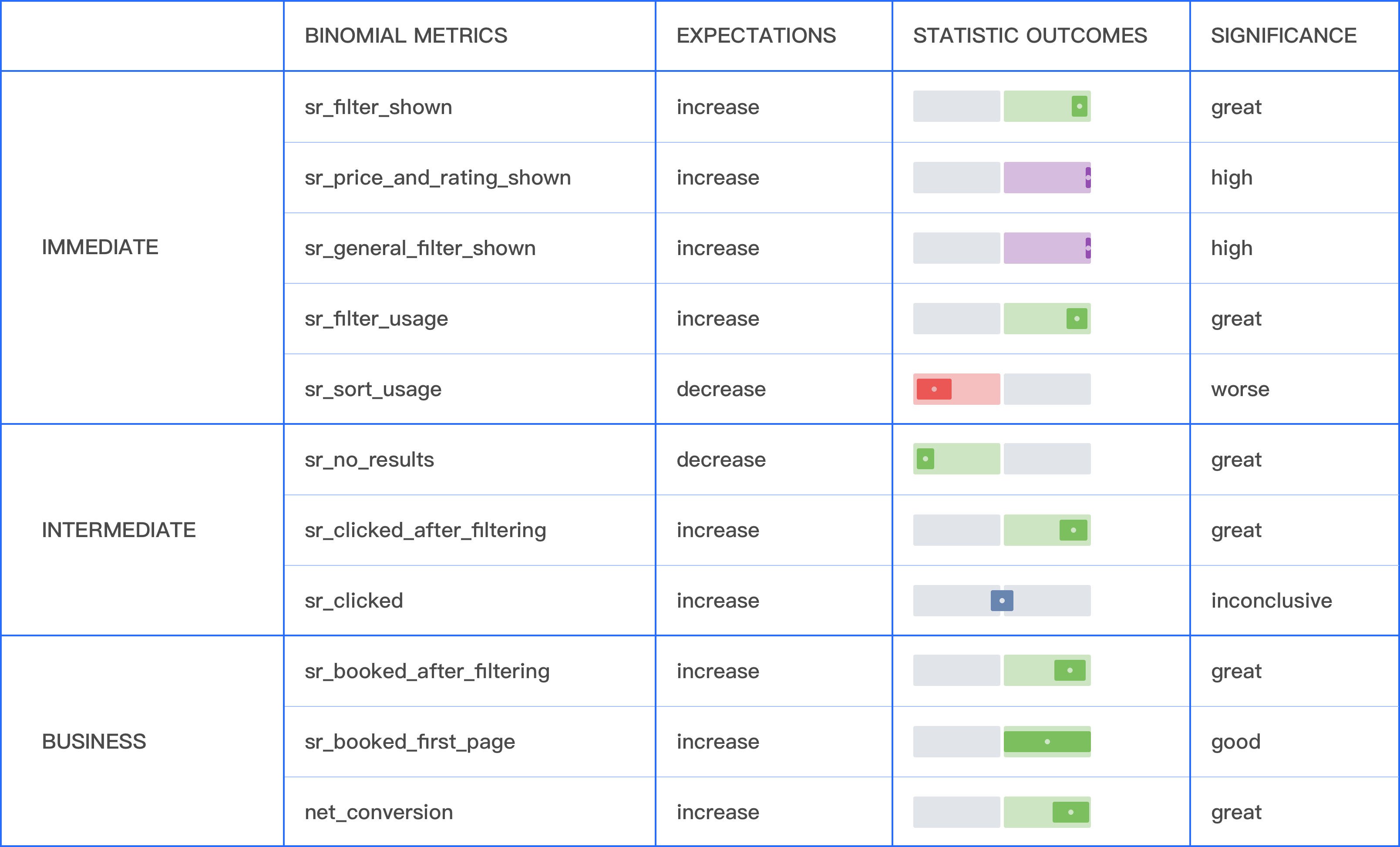
To confirm causation and eliminate coincidence, we want to reject the null hypothesis that assumes any difference observed is simply by chance. We compute a p-value indicating the probability of seeing a particular result or more extreme, assuming there is no effect. Given sufficient power, results under the threshold where p-value < 0.05 are called statistically significant and we are confident that the variant is better than the base.
Take certain design stories as examples, I found the conclusiveness of results below.
I also tracked the distribution of average time users spent interacting with filters. It turned out the filter redesign reduced the interaction time from 7900ms to 6800ms for the representative population.