Re-Branding: a New Look of Guhao Dental Lab
CONTEXT
I have had the pleasure of making a new identity for Guhao Dental Laboratory, which offers quality craftsmanship ranging from denture products to orthodontic solutions.
The company was then facing new challenges and opportunities as it incorporated digitalization and 3D printing into its business. During this transition, Guhao needed some design help to create a fresh brand identity, build a mobile app that would visualize work efficiency and facilitate production pipeline, as well as establish a public website for promotional use.
BRAND IDENTITY
I started with creating a brand identity that set the basic tone for further design and development.
Goals
Working closely with the founders, we first made sure that the key product questions were addressed in the creative brief.
Creative Brief
Who are the target audiences?
The majority of audiences are dentists, dental clinics and stomatological hospitals.
What makes Guhao unique?
1. Accurate—3D scanning eliminates human errors and improves the fidelity of dental model reconstruction; 2. Rapid—3D printing allows the lab to automate and optimize the denture production workflow. 3. Economical—The production is very efficient because digitalization and 3D printing save the cost of energy and labor in the long run.
What product characteristics does Guhao want to promote?
Healthy, fast, economical, enduring and most importantly, high-tech.
Inspirations
After researching into the workflow, I gradually understood how things worked in a dental lab, especially how 3D scanning and 3D printing influenced its production pipeline. I collected the following inspirations for logo design.
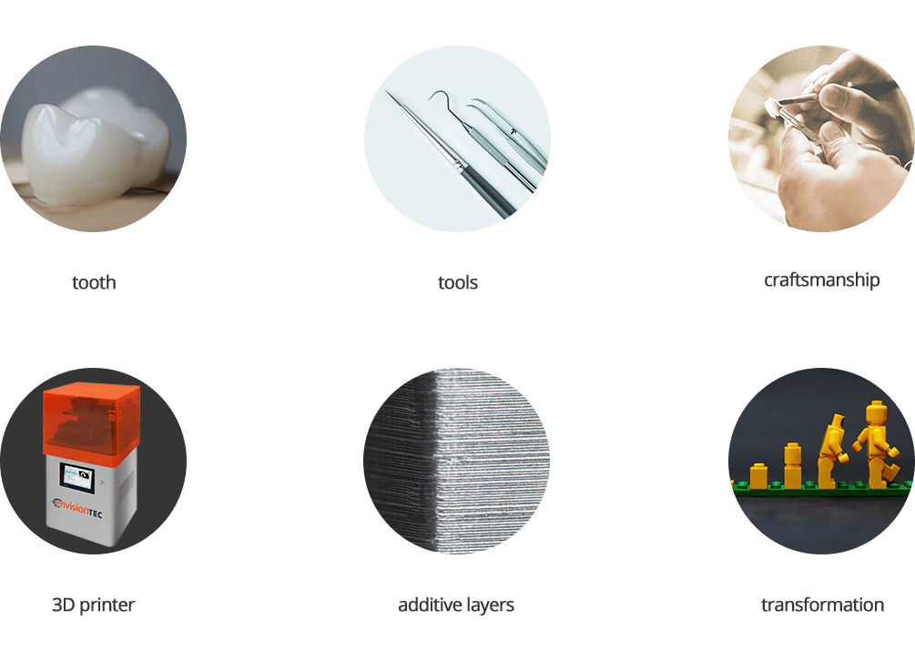
Logo
The logo itself is an abstraction of tooth viewed in 3D space. It is created in a style that appears to be perspective, simple and modern. The main idea is not only introducing the efficiency of advanced technology but also preserving the proficiency of traditional craftsmanship.

The logo is divided into layers in its bottom half. Why? Because this explains how 3D printer works in prototyping—a wax copy of denture model is created layer by layer. Considering each layer as a cross-section of the tooth, a 3D printer accumulates and stacks these layers, one upon the other, to form the final mass.
On the other hand, geometry and negative space simulate the incisions carved out by artisans, indicating the dedication to craftsmanship.
Below are a collection of logos in different themes.

The transformation of the logo, from bottom to top, from layers to unity, reveals the workflow of producing dental products in Guhao. Meanwhile, the straight lines and sharp corners indicate the efficiency and proficiency the company has been equipped with.
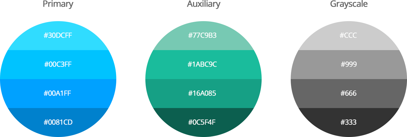
Color Palette
With the metaphor of health and technology, I chose to use cold colors of blue and green to form the color palette. Logo and the public website are consistent with regard to coloring.
MOBILE APP
I led the design work of a mobile app—Guhao Assistant for company's internal use.
Background
Creating crowns, bridges, and veneers follows strict steps. Each technician is in charge of a specific one and would pass the product onto the next once finishing his own.
The company used to ask technicians to write down their names under product's barcode in order to record and track. With a heavy switch to digital aided technologies, Guhao decided to make a new app that improves this process and therefore, benefits not only individuals but also the company.
User Needs
I started by doing user research. I found that 33 out of 35 technicians said that the action of writing down their names was tedious and pointless. I also interviewed 3 managers who would take extra time collecting, examining and recording data. They felt unintelligent and time-consuming. And all of them reported a frequent occurrence of errors or missing data.
Therefore, the app was supposed to be simple, encouraging and reliable, helping every member who participated in the denture production pipeline.
- On the one hand, it would help an employee put his work records into database, get reminded of everyday work progress, and understand his own work efficiency from the past.
- On the other hand, it would assist an employer get up-to-date work status from the backend, keep track of every denture product and people that are involved, and make decisions based on reliable data.
Key Approaches
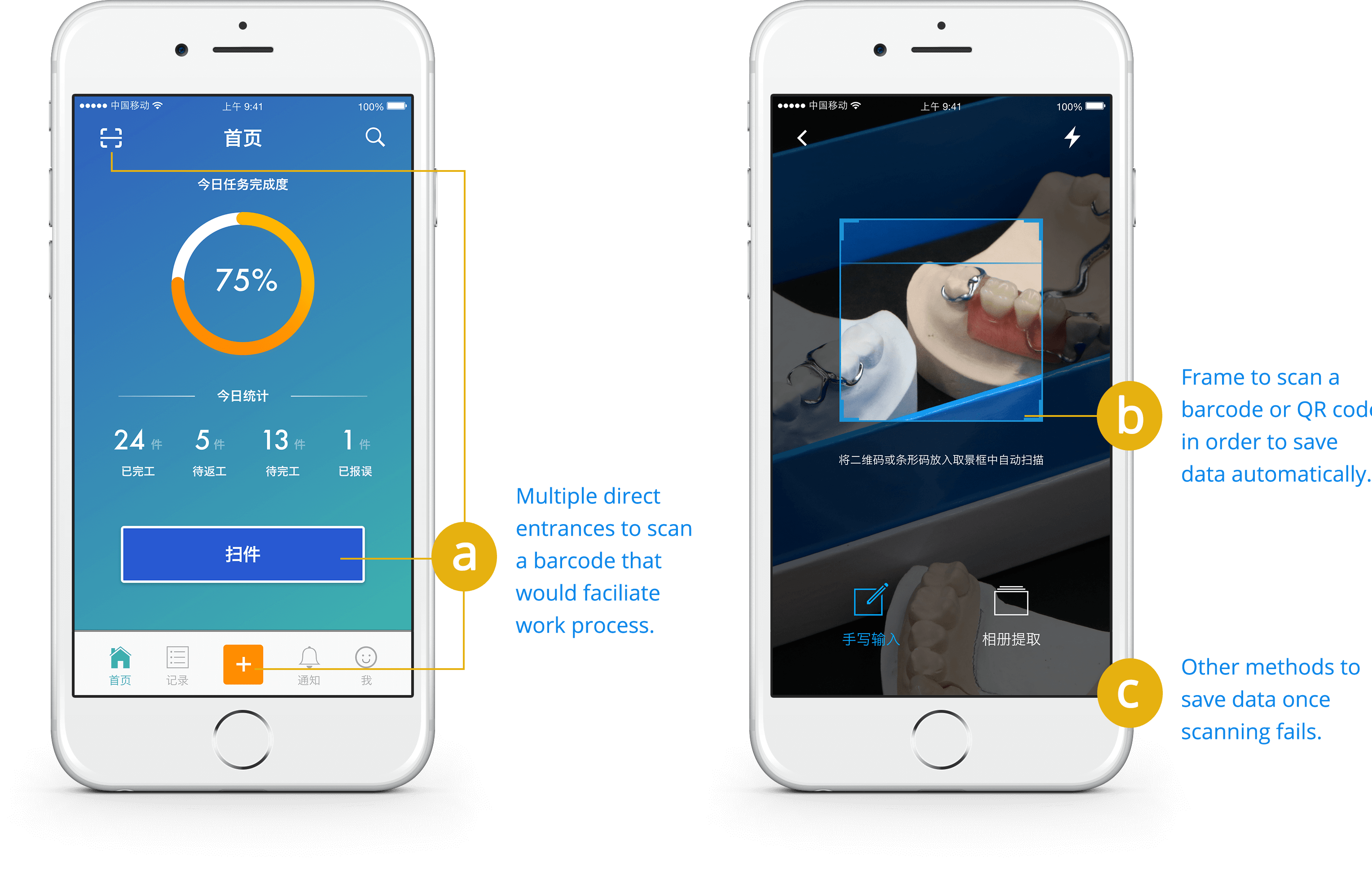
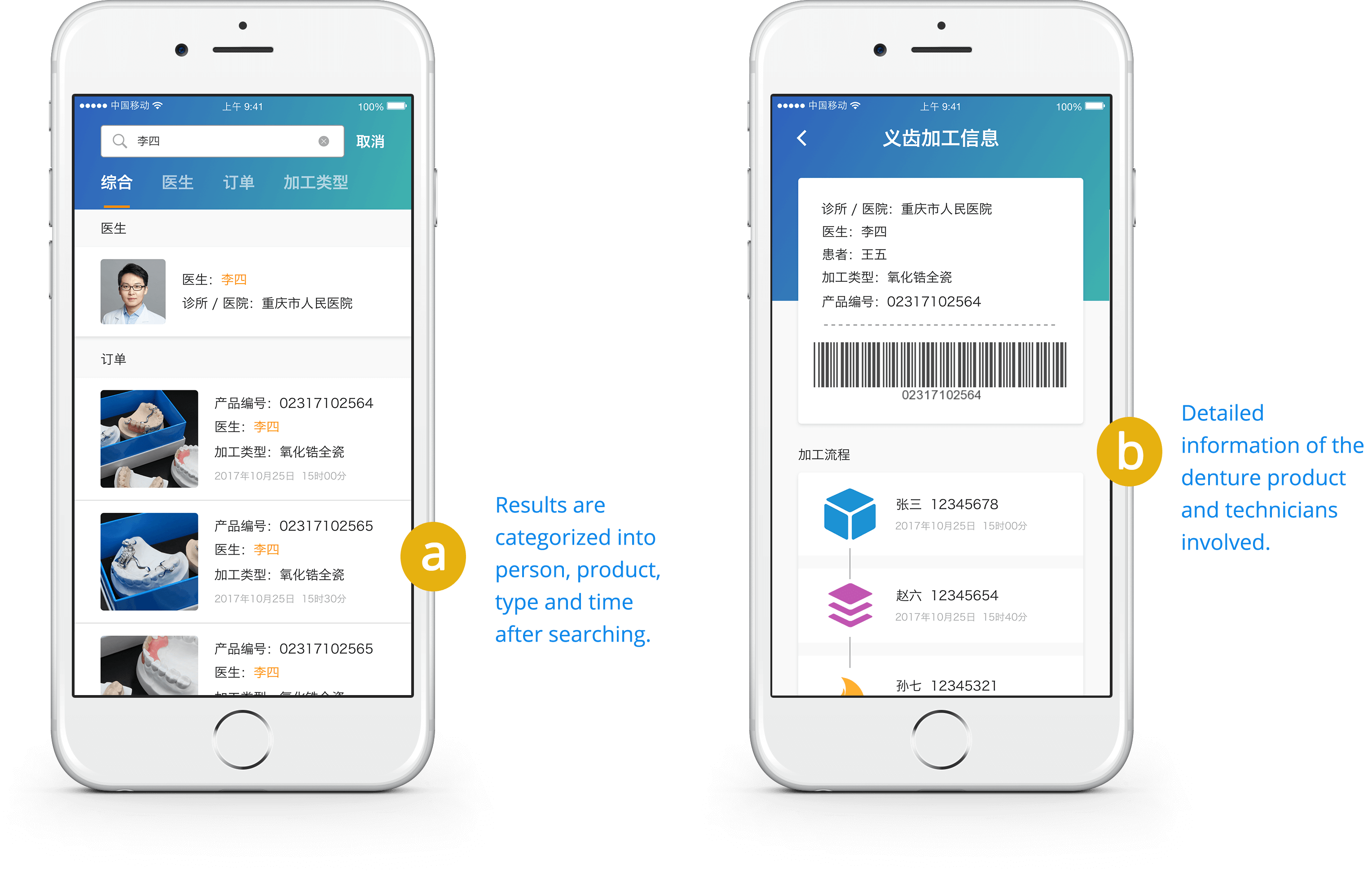
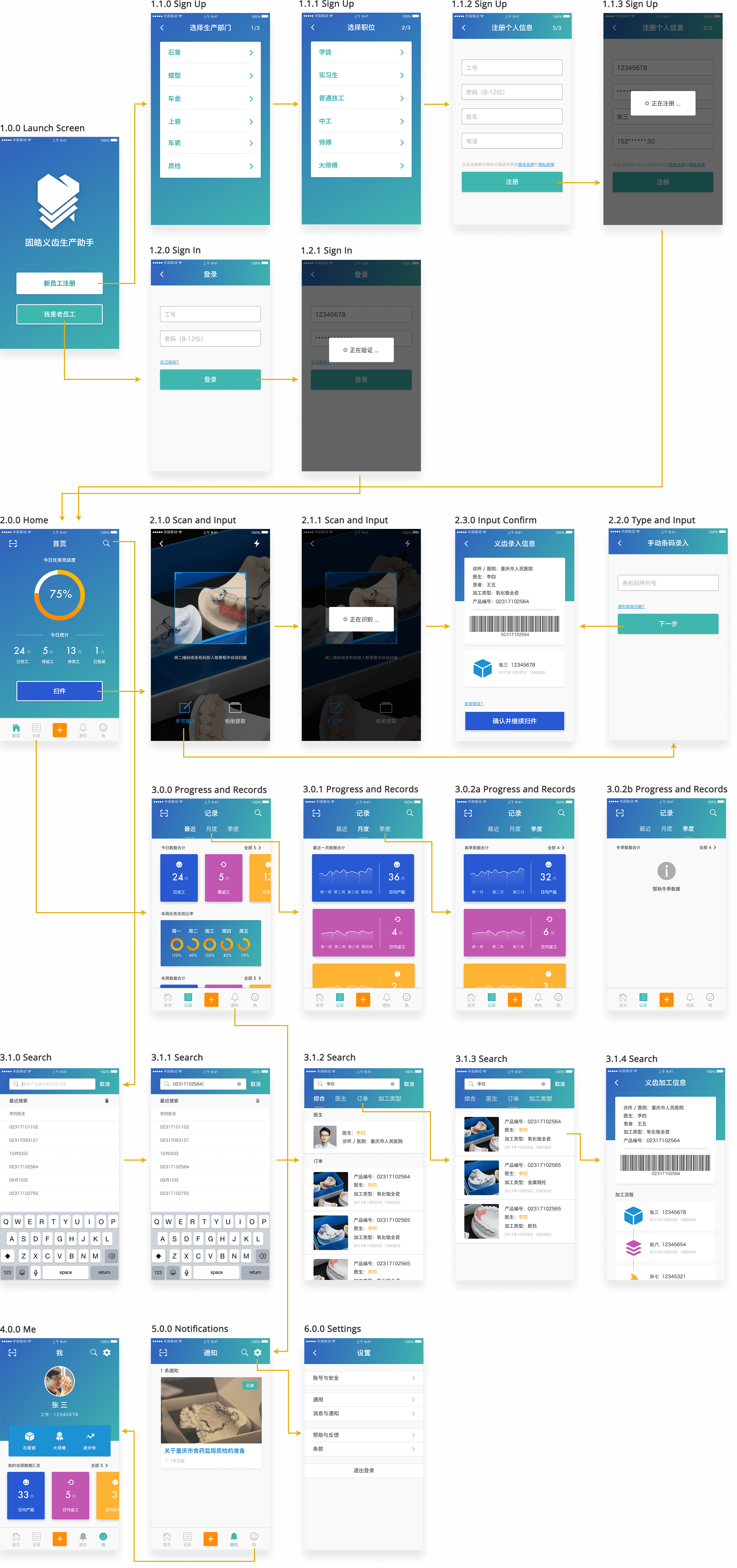
The approach to achieving simplicity was using QR code or barcode scan. Technicians were given access to this technology throughout the app—once finishing their parts, they would tap a 'Scan' button and aim at the code with the camera. After that, a record that bound them with the product would be saved automatically.
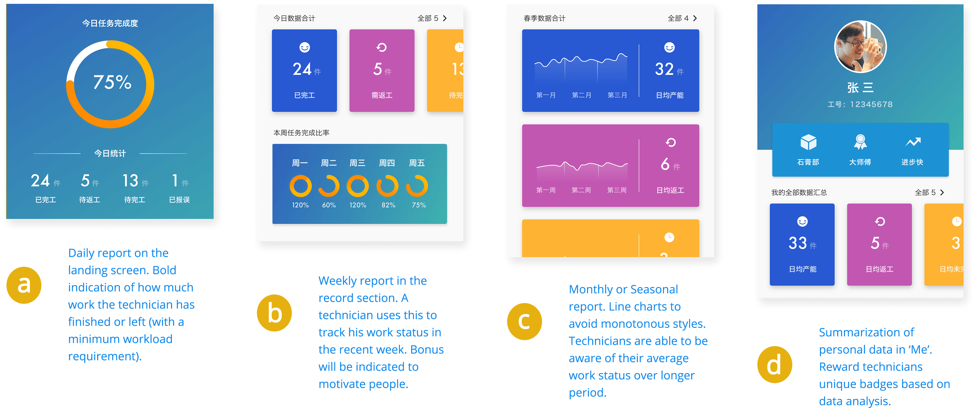
Data inserted could be used to compute KPIs related to work progress and efficiency. It was integrated into a dashboard and from that, a technician would understand his work status and be able to evaluate himself. This actually allowed the app to bring motivation and encouragement to employees.
Since all employees were registered with their ID and name, the app gave managers a reliable way of searching to track any record. Moreover, in case the scanning does not work, I also provided an alternative that technicians insert barcode manually.
Use Cases
After discussing with technicians, managers and stakeholders, I nailed down the required features. The key use cases I covered were:
- Log in and sign up
- View today's work progress
- Scan the barcode to automatically insert a record upon finishing one's own step of the entire process
- View work efficiency during time elapses
- Search for a specific record of current employee
- Receive company notifications
- View personal data and work summaries
Task Flows
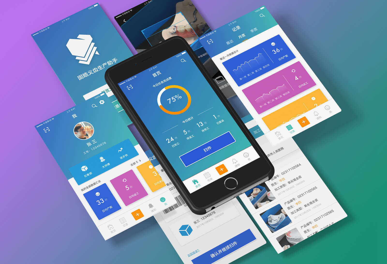
Below are some selected high-fidelity mobile screens and the screen flows.
Results
PUBLIC WEBSITE
I also led the design and development of public website. The architecture work was started first, then wireframes and finally a live website was created iteratively through the development phase.
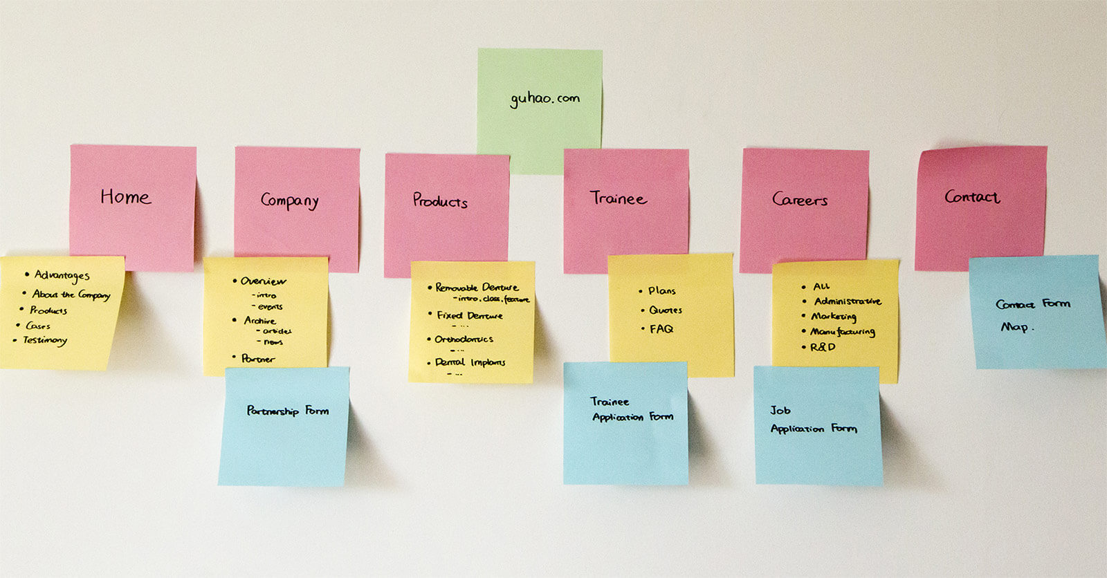
Architecture
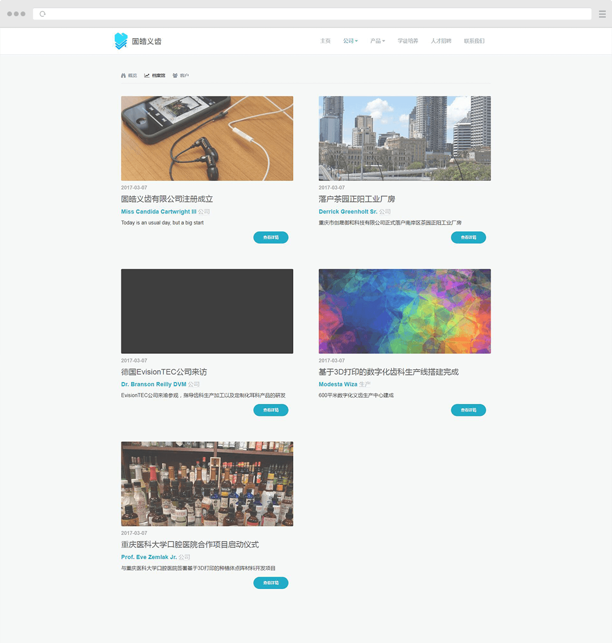
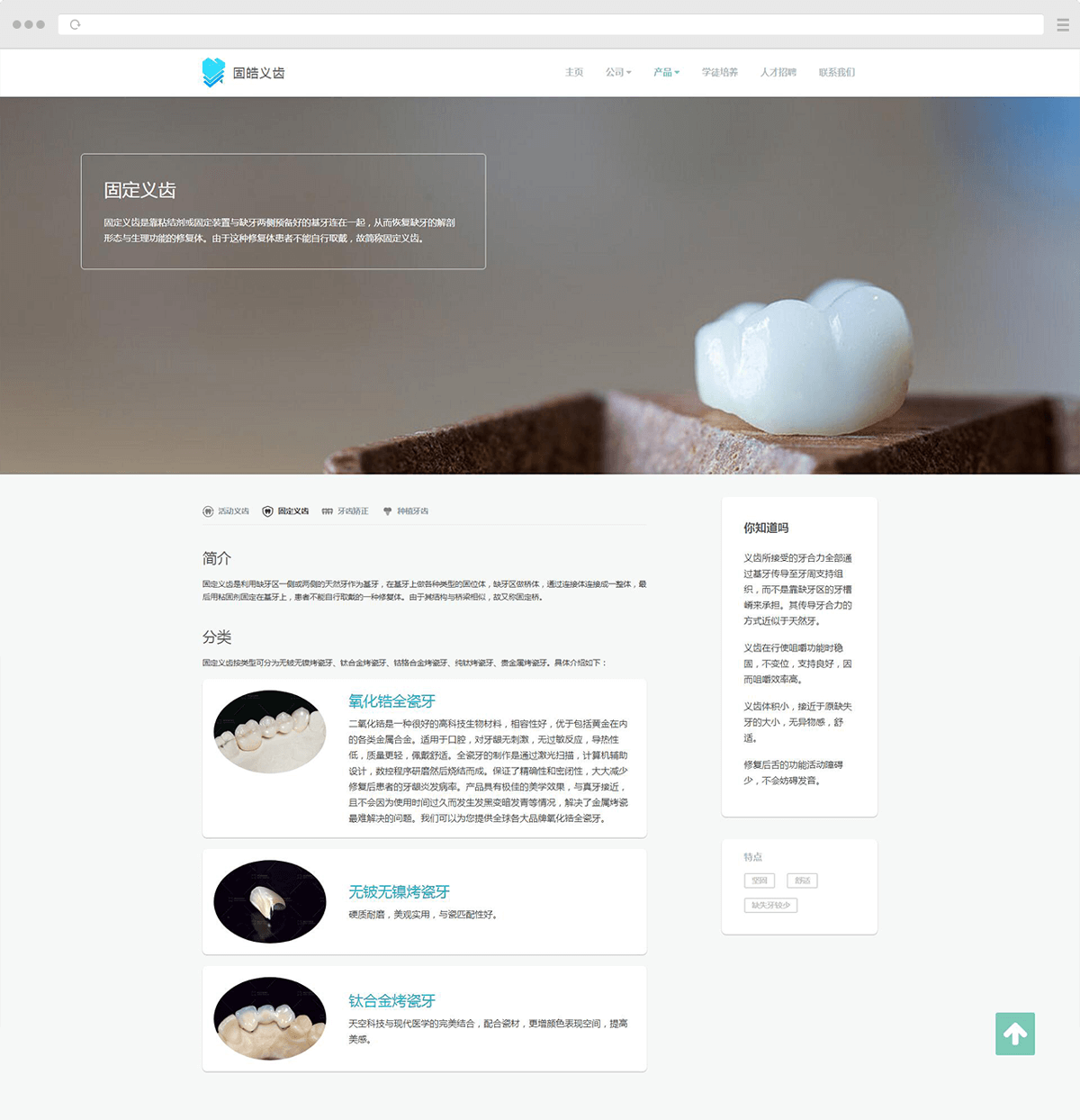
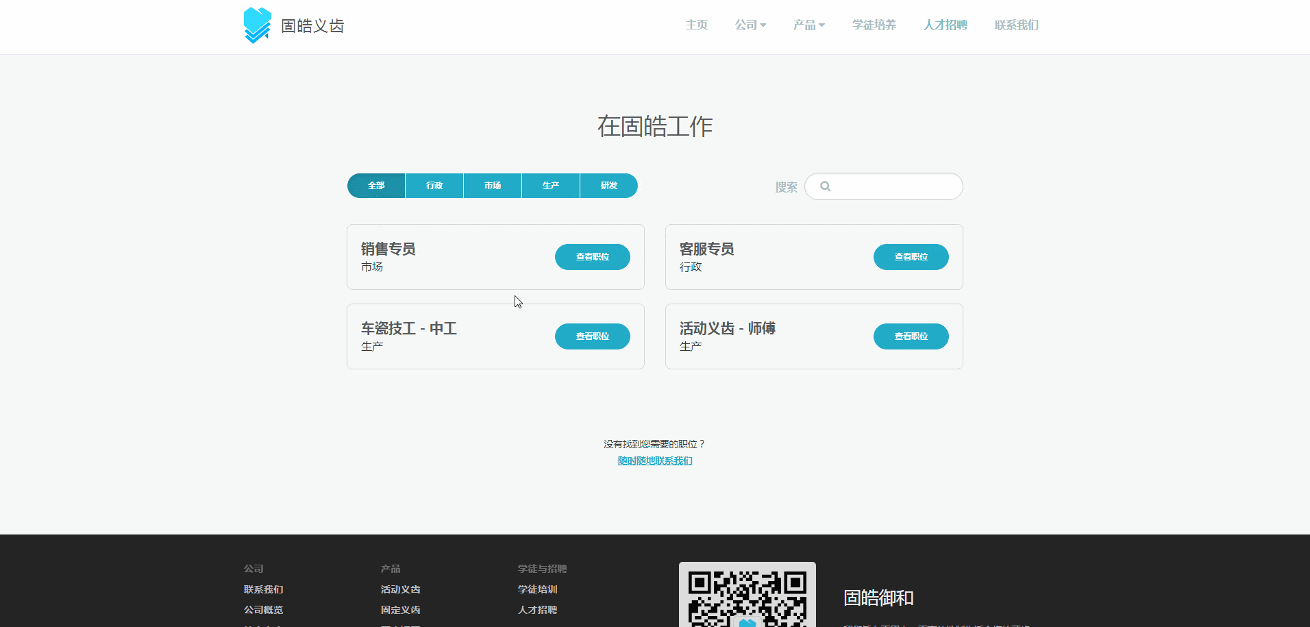
By dividing services and products into modules, I created the information architecture. Top-level modules are:
- Home—landing page of the whole website
- Company—introduction, news, articles and partners of the company
- Products—denture and orthodontic products, dental implants as a plus
- Trainee—program to educate and cultivate apprentices
- Careers—job application
- Contact—page to contact the company
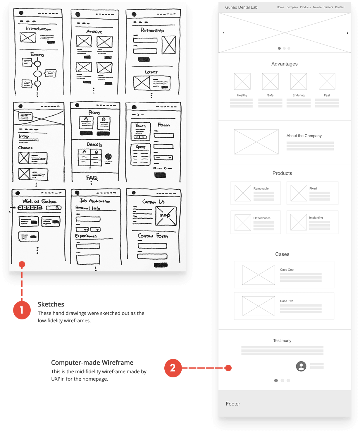
Wireframes
I then went through a quick process of wireframing. Some were sketched out by hand and some were created in digital.
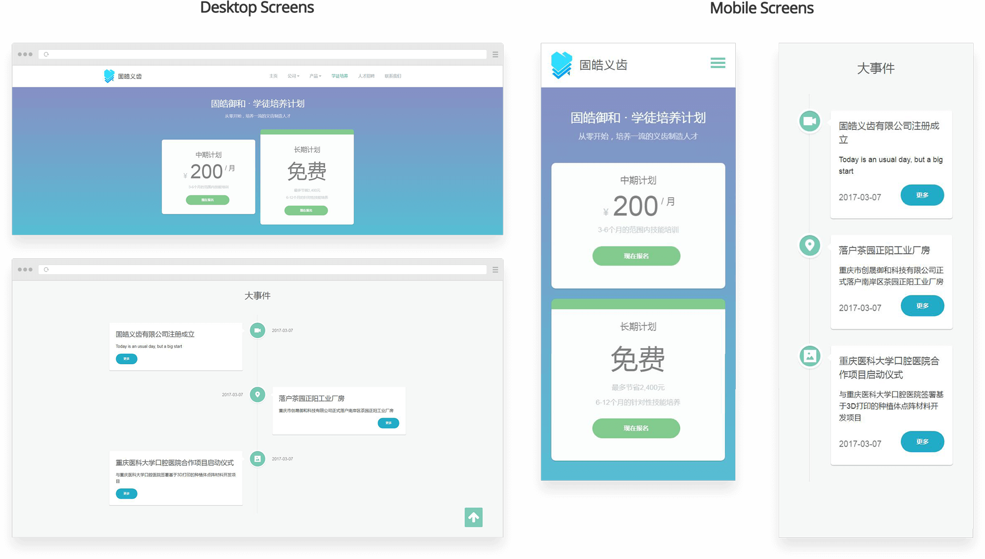
Responsive Design
Pages were designed for various screen sizes; they would adjust their layouts responsively.
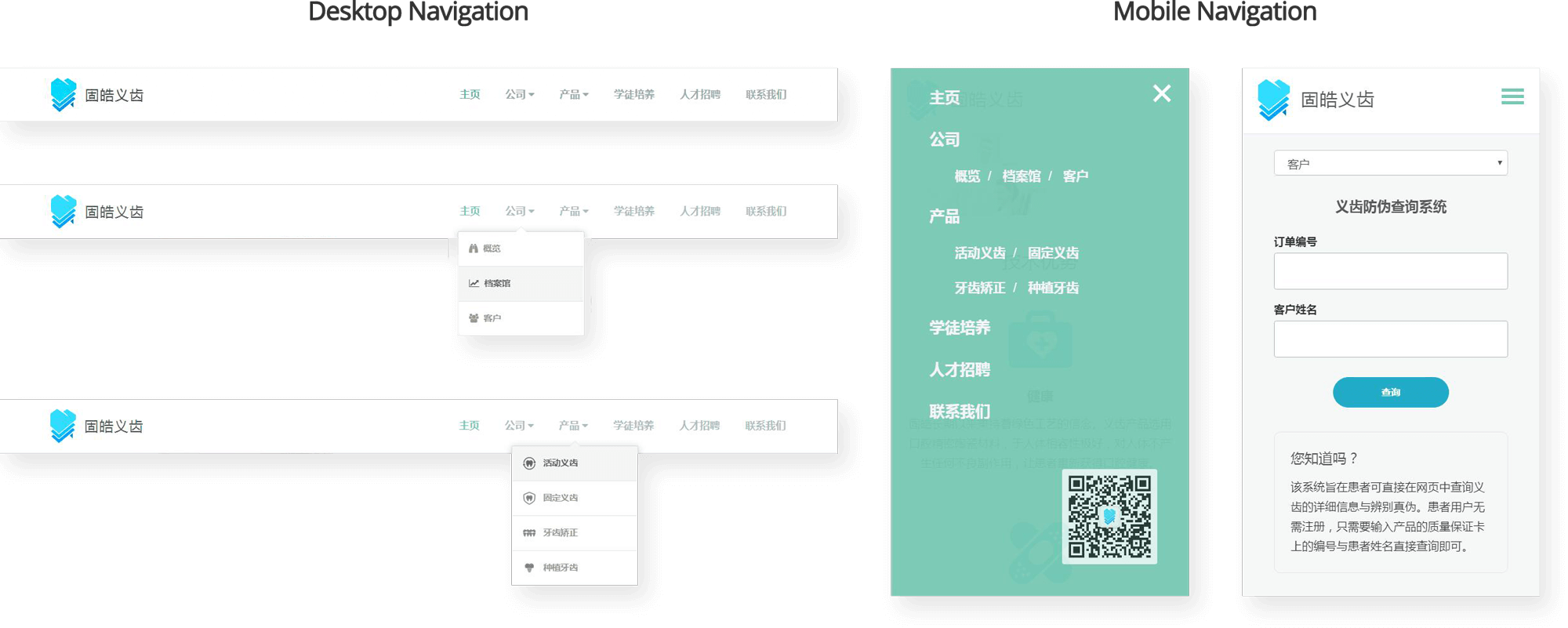
Navigation UI
The top navigation bar is based on the information architecture mentioned before. It would collapse into a hamburger menu on the mobile version.
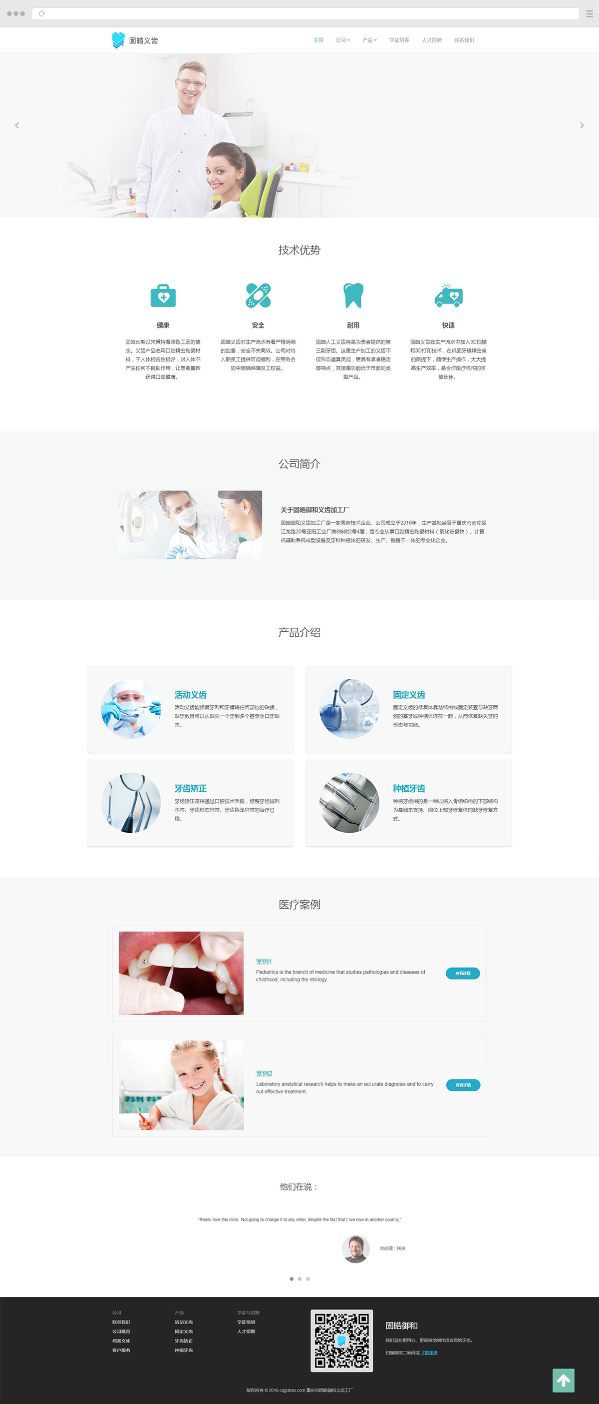
Results

CONCLUSION AND REFLECTION
I felt really excited that I had the practical chance to rebrand a product, from bootstrapping the brand identity, to designing a mobile app, to building a public website. It made me more than happy seeing a finished product, incorporating the ideas of design, technology as well as business.
More importantly, working with Guhao Dental Lab substantiated the value of collaboration. Designers have to fully understand what their clients need before they dive into details. And I realized that the design should reflect the value of an enterprise in order to stand out from competitors.